
Time-mimic / Rolex dial reading guide
Good copy Rolex watches: choose the dial you can enjoy every day
A good copy Rolex watch should match the way you want to read the time and the way you want the dial to look on your wrist. First, start with information density. A three-hand face feels calm. A date window adds one practical point. A GMT hand and numbered bezel create a travel-style layout. Subdials make the face busier and more technical.
This page arranges twelve real Time-mimic product listings into three four-watch chapters. The first chapter keeps the reading path simple. Next, the second adds stronger bezels, calendar details and warmer colour. Finally, the third compares GMT and Daytona layouts. You can move from one chapter to the next by following the dial details you enjoy seeing.
Every card uses the product’s matching white-background photograph and current listing starting price. The QC section uses complete gallery images and playable video for three selected references. When two models remain, the WhatsApp buttons keep the exact links inside your conversation.
These are replica Rolex-style watches, not genuine Rolex products. Time-mimic is not affiliated with Rolex. Product names identify the design reference shown.
Decide how much information you want on the dial
Your eyes usually find the same features first: the hour markers, the hands, a date window and then any extra scale. Then decide which of those features should remain visible at a quick glance. The answer gives you a dependable way to sort twelve watches before colour and bracelet preference enter the decision.
The three routes below organise familiar Rolex references by the way the dial reads. Choose the layout you enjoy, then use the product page, QC photographs and WhatsApp conversation for the exact model.
Calm three-hand reading
Choose this route when you want the hour markers and hands to remain the main information. The Explorer and Oyster Perpetual are the clearest examples. The two Datejust choices add a date window and more surface detail without changing the central reading path.
This route suits buyers who want the watch to work across casual clothing and office wear. For example, colour and bezel finish can provide personality while the dial remains easy to understand.
Stronger frame and calendar
Choose this route when the bezel should be part of the watch’s identity. For instance, blue, black and brown-black frames make the edge visible before you read the centre. A day or date display adds another clear reference point.
Therefore, the four models give you a useful range from a single date window to a full day-and-date direction and a GMT-style fourth hand.
Travel scale or chronograph layout
Choose this route when you enjoy more information around the face. Two GMT watches use numbered bezels and additional hands. By comparison, two Daytonas use subdials and a marked outer scale.
The decision is mainly about reading rhythm. A GMT layout still centres the main time, while a Daytona face divides your attention between several circular displays.
Use this dial-reading scale before you compare colours
| Your preferred glance | What stays most visible | Start with |
|---|---|---|
| One quick central reading | Three hands and large hour markers | Explorer 124270, Oyster Perpetual 124300 |
| Time plus one calendar point | Central hands with a date window | Datejust 126334, Submariner 126610LN |
| Time plus day and date | Two calendar windows in a formal layout | Day-Date 128238 |
| Home-time style plus an outer scale | Main hands, additional hand and numbered bezel | GMT-Master II 116719, 126710GRNR, 126711CHNR |
| A multi-display racing look | Three subdials and a marked outer ring | Daytona 116500, Daytona 116519 |
Chapter one: calm dials for an easy daily glance
These four watches keep the main reading path near the centre. Black, blue and green create different moods, while smooth and fluted-looking bezels change the amount of reflection around the face. The first two watches are the quietest. The Datejust pair gives you more polished detail and a date window.
Use this chapter when you want your Rolex-style watch to support your clothing instead of leading it. A restrained black face works with almost any neutral outfit. Meanwhile, blue or green adds colour while keeping a familiar round case and bracelet.
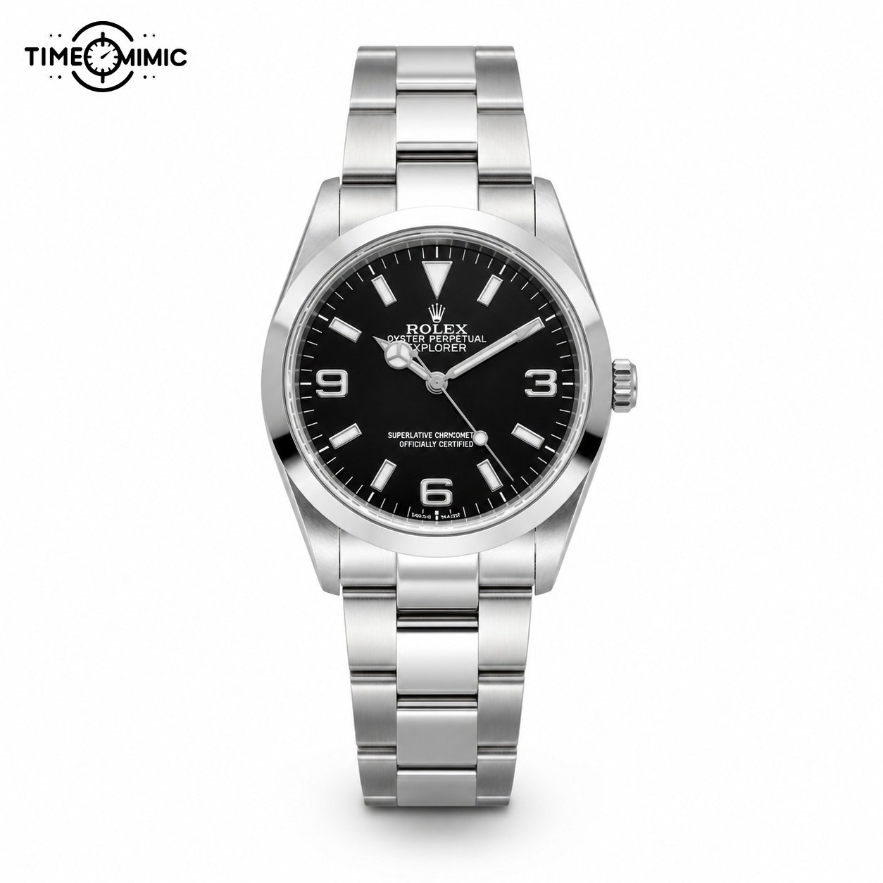
Rolex / Rolex Explorer black
Explorer 124270: black dial, direct reading
Model listing starts atUS$657
The large 3, 6 and 9 numerals make the dial easy to recognise. As a result, a smooth border and straight steel-tone bracelet keep the surrounding detail controlled.
Choose it when you prefer a compact visual centre and want the watch to sit quietly beside casual shirts, knitwear or a simple jacket.
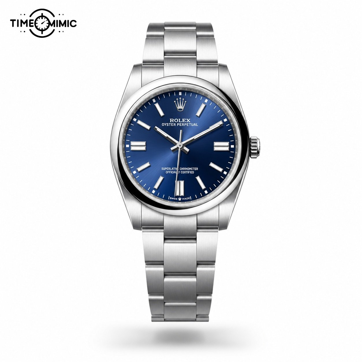
Rolex / Rolex Oyster Perpetual blue
Oyster Perpetual 124300: blue without extra windows
Model listing starts atUS$657
A blue face supplies colour while the three-hand layout stays simple. At the same time, baton-style hour markers and a smooth border keep the dial open.
Choose it when a coloured face matters more than a date display. It gives you a cleaner reading path than the Datejust models beside it.
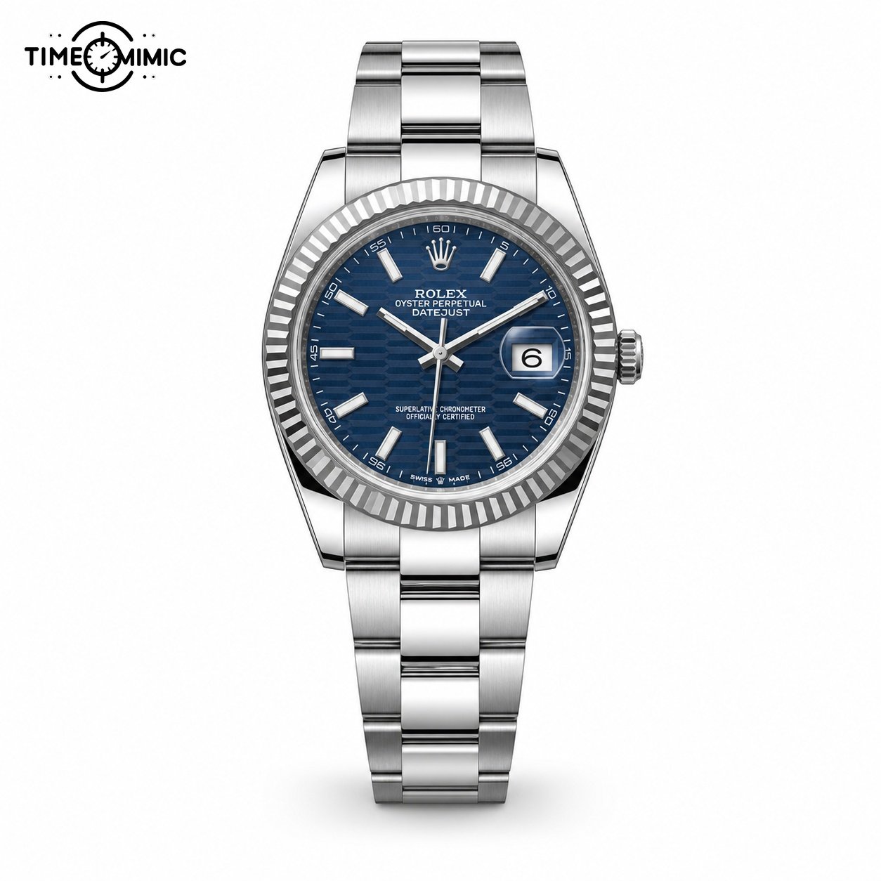
Rolex / Datejust 126334 Blue Motif
Datejust 126334: blue motif and polished detail
Model listing starts atUS$687
The blue patterned face, date window and fluted-looking bezel add texture around a familiar central layout. In addition, the bracelet uses more divided links than the Explorer.
Choose it when you want a blue daily watch with visible detail around the dial. It works as a bridge between the quiet first two models and the brighter green Datejust.
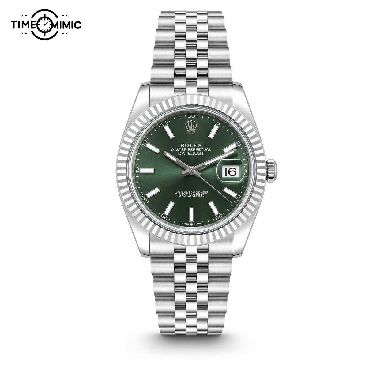
Rolex / Rolex Datejust green
Datejust 126334-0028: green as the focal point
Model listing starts atUS$687
The green face takes the leading role, framed by a fluted-looking bezel and a steel-tone bracelet. A date window keeps one practical feature visible at the right side.
Choose it when you enjoy the Datejust layout and want the dial colour to remain noticeable at arm’s length.
How to use the calm-dial chapter
Choose the first feature your eye should find
The Explorer directs your eye to large numerals. The Oyster Perpetual directs it to colour. The Datejust pair adds a patterned face, date window and reflective-looking border.
Pick one leading feature. If you choose colour, compare blue and green. If you choose speed of reading, compare the Explorer and Oyster Perpetual.
Keep the bracelet in the same decision
The Explorer and Oyster Perpetual use a simpler link pattern in their photographs. The Datejust watches show a more divided bracelet direction.
Look from the dial down to the first three links. Choose the complete configuration that fits your taste instead of treating the face and bracelet as separate purchases.
Use colour with your real wardrobe
Black is the quietest option in this group. Blue works easily with denim, navy and gray. Green makes the dial a more visible accent.
Think about the shirts and jackets you already wear. The best colour is the one that has a clear place in your week.
Chapter two: bezels, calendar windows and warmer colour
The second chapter makes the outer frame more visible. Two Submariner references use marked bezels in blue or black. Meanwhile, the Day-Date uses a warm coordinated colour and two calendar windows. The Root Beer GMT combines a brown-black bezel, warm centre links and an additional hand.
Choose from this chapter when you want more information or colour before reaching the full multi-display layouts. The four watches still keep the main hour and minute hands visually central.
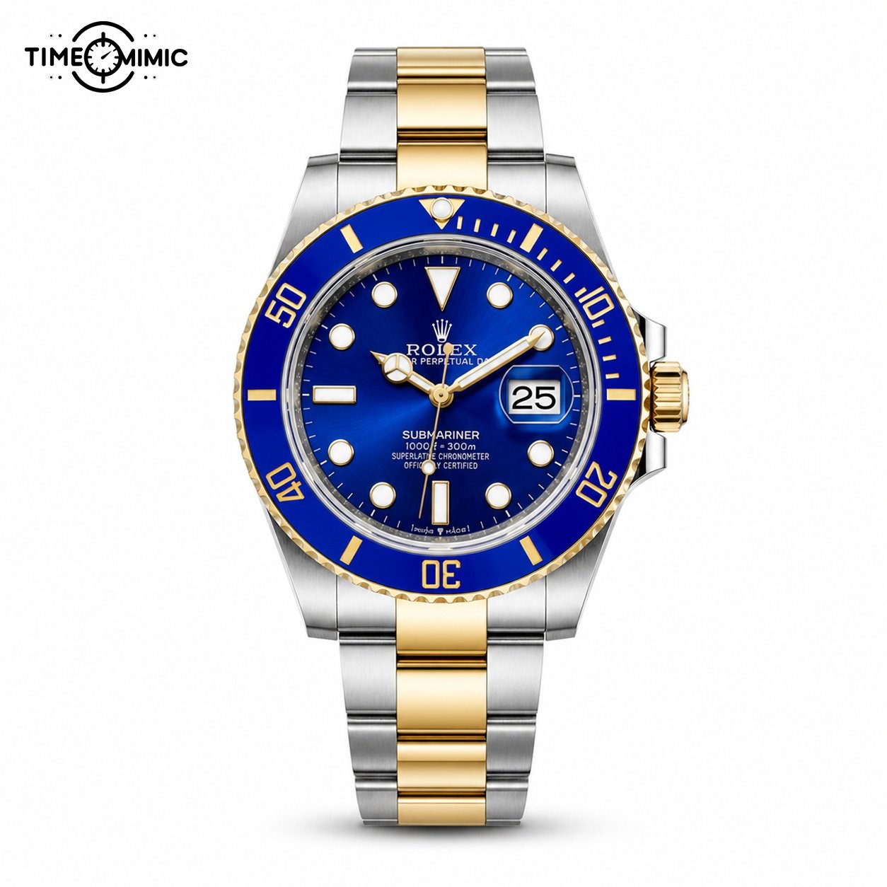
Rolex / Submariner Blue Two Tone
Submariner 116613: blue bezel and two-tone direction
Model listing starts atUS$687
Blue covers the bezel and dial, while warm-tone centre links add a second colour through the bracelet. As a result, large markers keep the face legible despite the stronger frame.
Choose it when you want a sports outline with a visible colour combination. It makes a brighter statement than the black Submariner.

Rolex / Submariner Black Date Steel
Submariner 126610LN: black frame, familiar contrast
Model listing starts atUS$657
A black marked bezel surrounds a black dial with light hour markers and a date window. In contrast, the steel-tone bracelet keeps the colour palette narrow.
Choose it when you want the stronger Submariner outline without adding blue, green or warm-tone links.
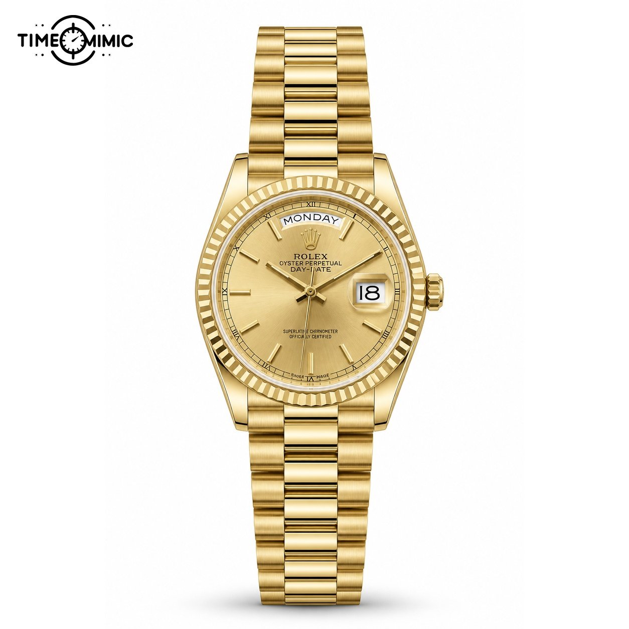
Rolex / Rolex Day-Date champagne
Day-Date 128238: warm colour and two calendar windows
Model listing starts atUS$1,045
The day window crosses the upper dial and the date sits at the right. Warm tone continues through the case and bracelet, creating a coordinated dress direction.
Choose it when the calendar layout and full-watch colour matter more than a marked sports bezel.
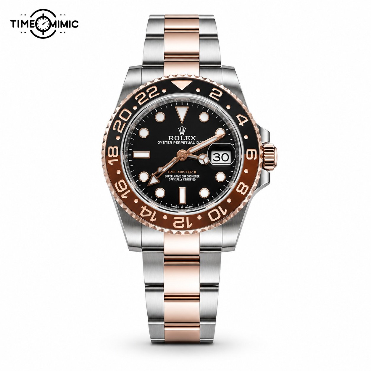
Rolex / Rolex GMT-Master II Root Beer
GMT-Master II Root Beer: warm sport contrast
Model listing starts atUS$1,015
A brown-black numbered bezel, dark dial and warm-tone centre links create several clear colour zones. The additional hand adds another reading cue to the centre.
Choose it when you want a GMT-style face with warmer colour than the steel-tone Pepsi and black-gray references in the next chapter.
How to compare a bezel with a calendar
Let the outer frame set the first impression
Blue, black and brown-black bezels create different boundaries around the dial. The Day-Date replaces that marked sports frame with a fluted-looking dress border.
Choose the sports models when the bezel should be visible at a distance. Choose the Day-Date when the calendar and warm colour should remain central.
Decide how many calendar cues you want
The Submariners use a date window. The Day-Date adds the day across the top. The GMT introduces an additional hand and outer numbering.
More information changes the look as well as the reading process. Pick the layout you enjoy seeing, then use the model link for the exact order conversation.
Choose warm tone deliberately
The blue Submariner and Root Beer GMT mix warm and cool areas. The Day-Date uses warm colour across nearly the entire watch. The black Submariner stays neutral.
A mixed finish gives you contrast. A full warm direction gives you a stronger dress statement. Both choices are clear in the complete product photographs.
Chapter three: GMT scales and Daytona subdials
This chapter contains the busiest faces on the page. The two GMT choices use an additional hand and a numbered bezel. The two Daytona choices divide the dial into three subdisplays and add a marked outer ring. Therefore, look at the whole card before reading every small element.
Choose the GMT direction when you want the central time to remain dominant. Choose the Daytona direction when the subdial arrangement is part of the style you enjoy. The white-background cards keep all four full watches at a comparable size.
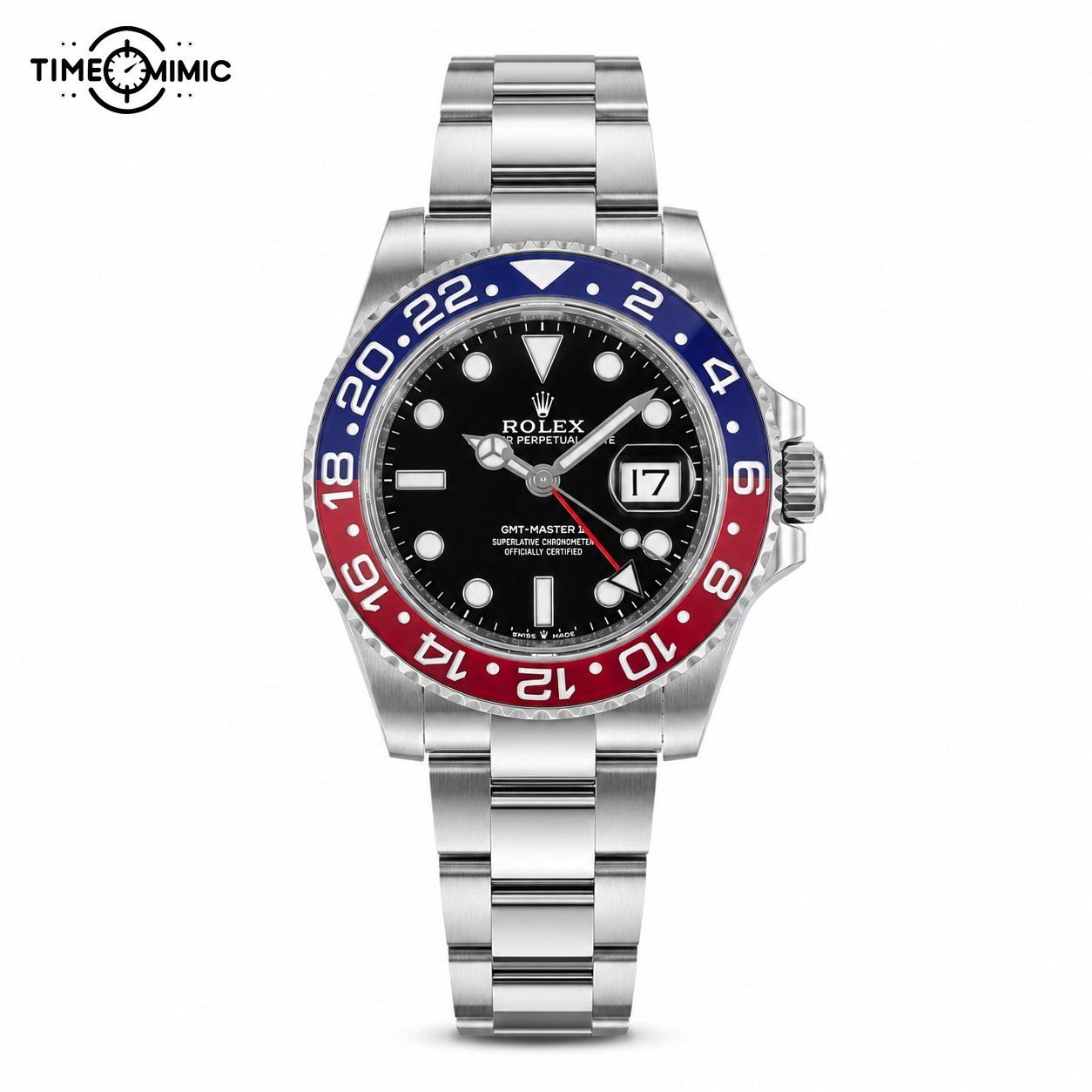
Rolex / GMT-Master II Pepsi Oyster
GMT-Master II 116719: red-blue bezel on an Oyster-style bracelet
Model listing starts atUS$1,015
The divided red-blue bezel supplies a strong colour identity around a dark dial. An additional hand creates another visible line through the centre.
Choose it when you want the Pepsi colour combination and prefer a broader, less divided bracelet direction than a Jubilee-style look.
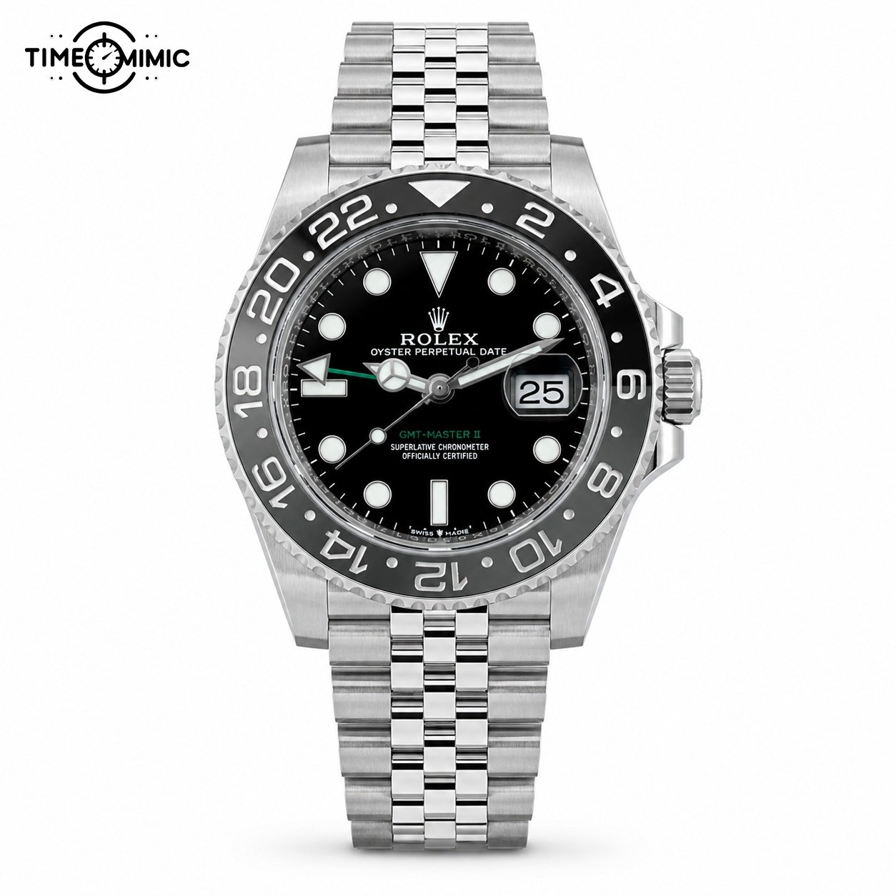
Rolex / GMT-Master II Black Gray Steel Jubilee
GMT-Master II 126710GRNR: black-gray restraint
Model listing starts atUS$955
The black-gray bezel keeps the numbered frame quieter than the red-blue option. In addition, a more divided bracelet adds detail below the case.
Choose it when you like the GMT layout but want the bezel colour to stay neutral. Compare the bracelet pattern with the 116719 before deciding.
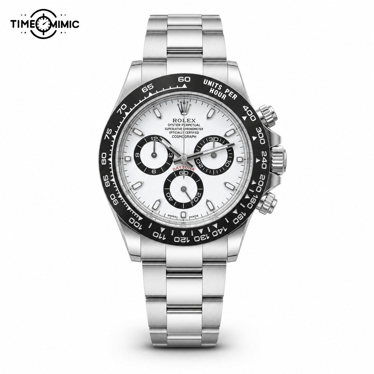
Rolex / Daytona 116500 Panda
Daytona 116500: white centre and black subdial contrast
Model listing starts atUS$1,075
A white face, dark subdial rings and dark marked bezel create a graphic black-and-white layout. The bracelet keeps the complete watch bright below the case.
Choose it when you want a multi-display face with high contrast and a full steel-tone bracelet.
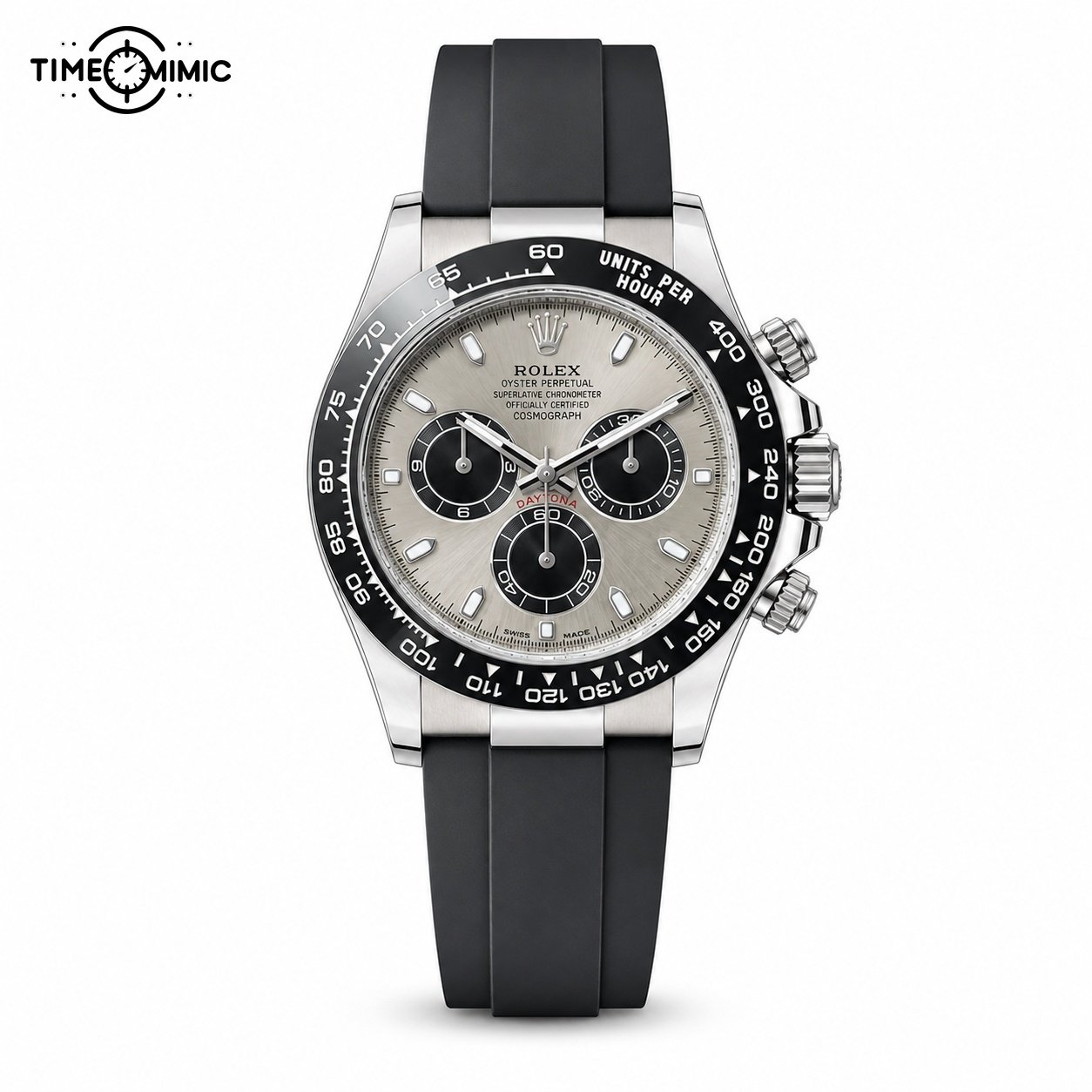
Rolex / Daytona 116519 Silver Black Oysterflex
Daytona 116519: silver face on a dark strap
Model listing starts atUS$1,075
The three subdials remain visible against a silver-tone face, while the dark strap separates the watch head from the wrist. The configuration feels more contrast-driven than the bracelet model.
Choose it when you like the Daytona layout and want the band to create a black frame around the case.
How to choose between GMT and Daytona layouts
Follow the central hands first
On the GMT watches, your eye can still begin with the main hands and hour markers. The numbered bezel and additional hand form a second layer.
Choose a GMT direction when you want a busy outer edge without dividing the dial into several circles.
Read the subdial pattern as a graphic choice
The Daytona models place three circular displays inside the main dial. That pattern is visible even when you are not reading each small marking.
Choose the white bracelet model for a brighter complete watch. Choose the silver-black strap model when you want a dark band around the case.
Use colour to separate the finalists
The Pepsi bezel is the strongest colour statement in this chapter. The black-gray GMT is more restrained. The two Daytonas rely on black, white and silver-tone contrast.
Once you choose between GMT and chronograph-style layout, colour should reduce the four models to one or two.
Inspect complete watches in the product galleries
The three gallery examples below connect the page’s reading scale to actual Time-mimic media. The Explorer shows the calm three-hand end of the range. The Datejust adds colour, a date window and a more reflective-looking border. The Daytona shows how subdials change the face.
Each photograph remains complete and uses its original gallery background. The matching video can be played in the page, allowing you to follow the case, dial and band as the watch turns. These media belong to the linked product pages.
Use the gallery example closest to your chosen chapter, then return to your exact product card. Send that card link on WhatsApp so the conversation stays attached to the right reference.
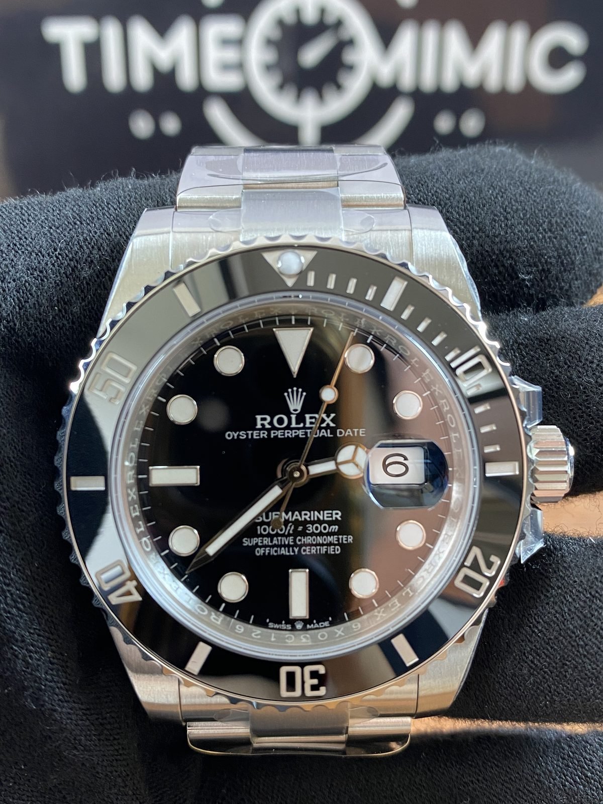
Submariner Black Date Steel
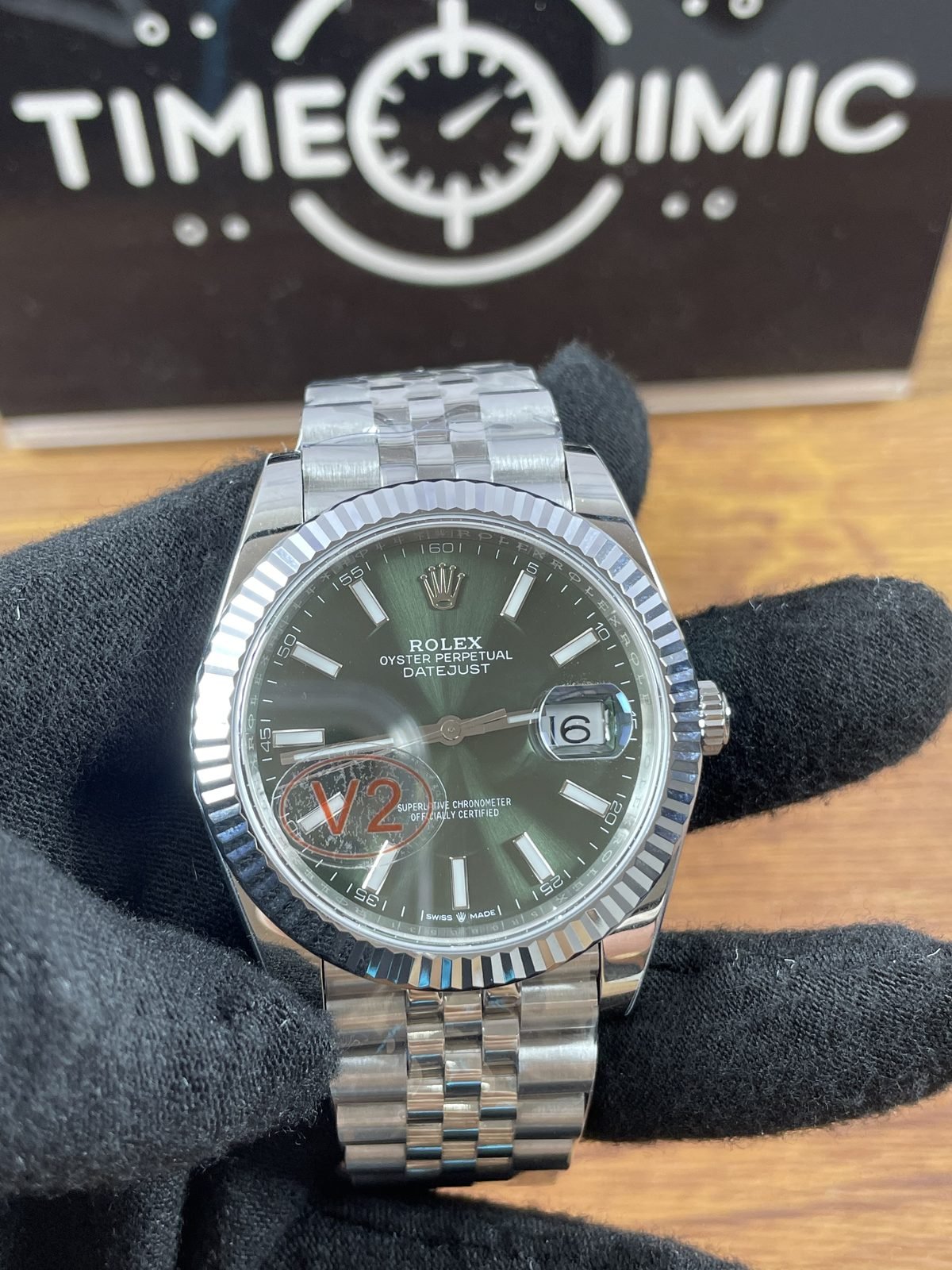
Rolex Datejust green
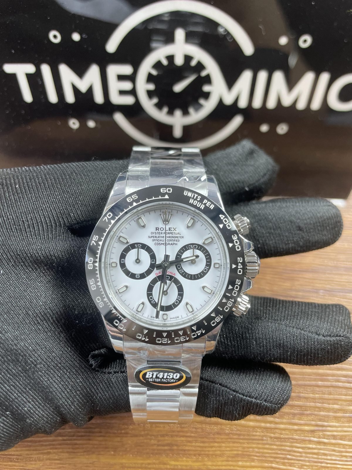
Daytona 116500 Panda
Turn the reading scale into a two-model decision
Name the layout before the colour
Write one of three phrases: calm centre, strong bezel and calendar, or travel and timing. That phrase identifies the chapter you should keep.
Then choose colour inside the chapter. This order prevents a bright dial from pulling you toward a face that feels too busy for your taste.
Choose one bracelet or strap direction
A simple steel-tone bracelet, a more divided bracelet, a two-tone direction and a dark strap all change the complete watch. Pick the band you would enjoy seeing with your usual clothing.
The card image shows the selected configuration. Keep that image and its exact model link together in your WhatsApp message.
Compare starting prices only between finalists
Every card displays the starting price from the linked Time-mimic product page. Use those amounts after the visual shortlist is complete.
Treat the amount as one part of your final comparison. Keep the model that gives you the layout, colour and band direction you selected.
Send the exact references on WhatsApp
Use one card button, then add the second product link. State the feature you are deciding between, such as a blue bezel versus black, or a GMT scale versus Daytona subdials.
That message gives us a clear starting point and keeps your request tied to the two watches shown on this page.
Messages from Time-mimic customers
These conversations already appear in the Time-mimic feedback gallery. Each image keeps the original exchange beside the delivery or wrist photograph, so you can read the buyer’s message and the Time-mimic reply together.
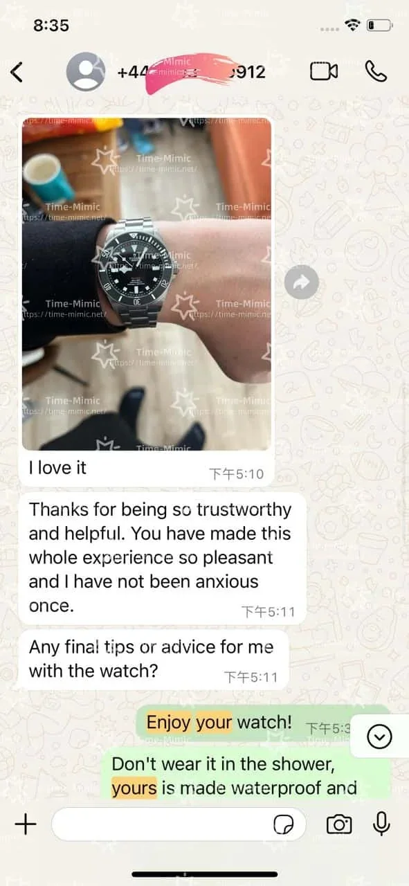
A wrist photograph after delivery
The buyer shares the watch on the wrist and continues the conversation with a care question.
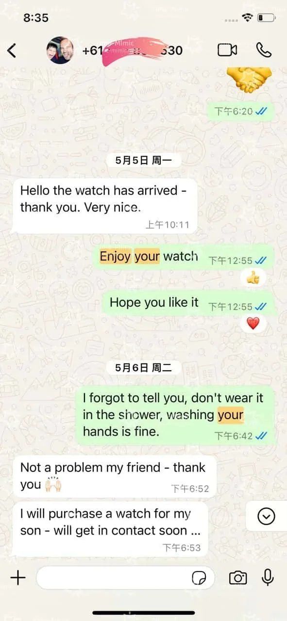
A message after arrival
This exchange records the arrival update and the next question in the same conversation.
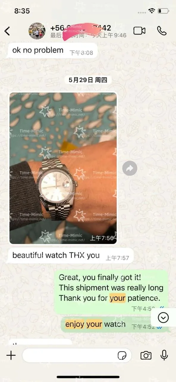
A customer photograph with its message
The photograph stays beside the original conversation, including the Time-mimic reply.
Questions about good copy Rolex watches
What does good copy Rolex watches mean here?
It is the target search phrase for this collection of replica Rolex-style watches. The products are not genuine Rolex watches. This page uses the phrase to help you compare real Time-mimic listings by visible layout, colour and band, without presenting the replicas as authentic branded goods.
Which model has the calmest dial in this selection?
The Explorer 124270 is the clearest starting point. It uses large 3, 6 and 9 numerals, three central hands and a smooth border. The Oyster Perpetual is also simple, with colour carrying more of the visual interest. Compare those two before moving to a date window.
Should I choose Datejust or Day-Date?
Choose Datejust when you want one date window, a coloured or patterned dial and a steel-tone bracelet direction. Choose Day-Date when you want both day and date windows with a coordinated warm-tone case and bracelet. The choice is visible in the complete product images.
How do I choose between the blue and black Submariner styles?
The blue 116613 adds a blue dial and bezel plus warm-tone centre links. The black 126610LN keeps the bezel, dial and bracelet in a narrower neutral palette. Choose blue for a stronger colour statement or black for easier coordination with neutral clothing.
Which GMT style is easiest to combine with clothing?
The black-gray 126710GRNR is the most neutral GMT option on this page. The Pepsi 116719 gives you a brighter red-blue outer frame, while the Root Beer 126711CHNR adds brown-black and warm-tone links. Choose according to how visible you want the bezel colour to be.
What is the visual difference between GMT and Daytona?
A GMT layout keeps the main time central and adds another hand plus a numbered bezel. A Daytona layout places three circular subdisplays inside the dial and uses a marked outer ring. Choose GMT for a layered central reading or Daytona for a clearly multi-display face.
Why does the page use twelve watches?
Twelve allows three complete four-card chapters: calm dials, frame and calendar, and travel and timing. Every product is a Rolex-style listing, and the four-card rows stay complete on desktop. The structure gives each watch a defined comparison task instead of repeating a general catalogue.
Are the white-background images matched to each product?
Yes. Each card uses the white-background image stored with the linked Time-mimic product record. The product name, starting price, URL and WhatsApp button remain inside that same card. The QC section uses separate gallery media from the indicated product pages.
Can I ask about a different dial or bracelet?
Send the exact product link first, then describe the change you want to discuss. We can address the available configuration during the WhatsApp conversation. A colour or bracelet shown on one reference is not automatically an option for a different reference.
How should I care for a model with a sports-style bezel?
Keep the watch dry, avoid solvents and follow the care guidance supplied with the chosen model. Choose the bezel and subdial layout for the way it looks, then ask about any reference-specific use question on WhatsApp.
How should I compare the prices?
Use the card prices as current listing starting points for the exact linked references. First choose two watches that fit your dial and band preferences. Then compare their starting prices and send both links on WhatsApp if you want help with the final choice.
What should I send in my first WhatsApp message?
Send one or two product links and name the layout you prefer. You can write that you want a calm black dial, a green Datejust, a neutral GMT or a black-and-white Daytona. Add your bracelet or strap preference and budget if those details will narrow the selection.
Send the two Rolex references you want to compare
Choose your preferred reading path first. Keep two product links, then tell us which dial, bezel or band detail separates them for you. The WhatsApp conversation can begin with the exact references already attached.
If you are still unsure, compare one calm watch with one information-rich watch. An Explorer beside a GMT, or an Oyster Perpetual beside a Daytona, makes your preference easier to see than two nearly identical choices.
Try that comparison at the size the watch will normally occupy in your view. Do not zoom into every marker at first. Look at the complete card and ask which face you can understand immediately, which colour fits your usual sleeve, and whether the bracelet or strap creates the outline you want. Those three observations are more useful than collecting reference numbers without a clear reason for keeping them.
When you message Time-mimic, include the model links rather than a generic screenshot. Write one sentence about the feature you want to preserve and one about the feature you might change. For example, you may want the blue bezel but prefer a quieter bracelet, or you may like the black-and-white Daytona contrast but want to compare it with the simpler black Submariner face. That gives the conversation a concrete direction while keeping your decision connected to the products shown here.